
Yesterday night i went to see 'The Crazies'. A remake of a 1973 horror/thriller. The poster to the left is from the 2010 version of the film. Firstly I'd like to talk about my opinion on the film and then I'll look into the other posters that have advertised the film.
The 2010 'The Crazies' was re-written by the same producers that have worked on 'The Amityville Horror' and 'Texas Chainsaw Massacre'.
My first thought of the film over all is that it's just another mindless zombie film, with guts and gore. Although as the film goes on it has a few unanticipated twists, but they don't really suspend the viewers disbelief any more than the previous turn in the road. My personal thought over all is that it's just another 'Dawn of the Dead'. And it's true, this genre of zombie air borne infections is a dead end. They end up the same, you have a survivor group that again are picked off gradually.
This is a very unoriginal idea and i was defiantly disappointed when watching it. Granted that the effects were scary, and i did jump on numerous occasions! The only part i enjoyed of the film was the end, as it ends on a possible opening for a sequel.
This is a very unoriginal idea and i was defiantly disappointed when watching it. Granted that the effects were scary, and i did jump on numerous occasions! The only part i enjoyed of the film was the end, as it ends on a possible opening for a sequel.
Posters
1973 poster 1
1973 poster 1
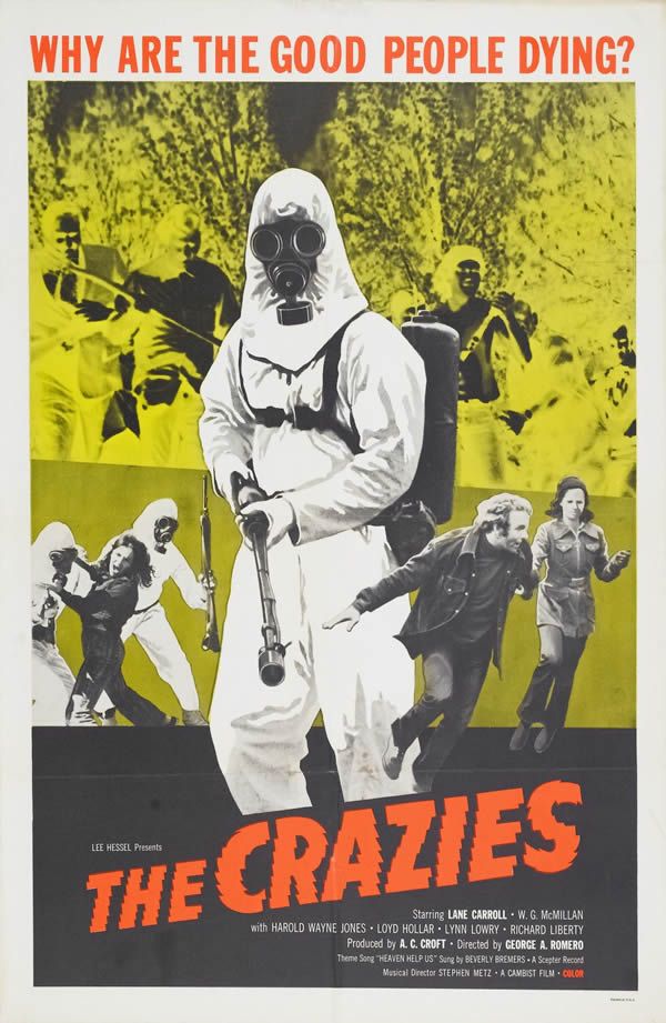
I really like the striking florescent colours here, they grab the audiences attention well, with the use of photo manipulations and layering techniques. The black and white figures stand out more dramatically against the background colour.
1973 Poster 2

This is the other original film poster, and it has a completly different look from the previous one. The coluors are incredibly intense and dark. The picture of the gas mask is seen as a scary image in those days as it was only 30 years after WW2 had ended. The red eye is the stand out feature against the bleakness of the rest of the poster.
2010 Poster 1

The desautrated colours and the overly harsh/clinical lighting here are the key conventions when decifering the genre of the 'new' film.
This poster is more like the second 1973 poster, as this includes the same colour theory. The red writing, symbolising blood and the tag line in white are effective although i feel it's more down to the font used.
2010 Poster 2

This poster was released first to advertise the film. Reason being as it holds very litte information, apart from the fact that, sombody is in need of help, and it's in a remote location. The colour of the tag line here is red, to represent blood but the fact that it's been scratched into the metal also the font/style it's written in is an indication that the writter is stressed or otherwise in a hurry.
2010 Poster 3

This is the second poster in a series of three (i cant find the other two on the internet). Styalized to look like a family portarit the colours are warm, and welcoming although the final imaging says otherwise.
The tag line here is different to the other ones. I feel thats a bit in conistent, but in the run up to the film, the changing of the tag line is an effective way to give away a bit more information to the viewer. The conistent font and style of the title is anice way to tie in all of the posters for the film.